Portfolio »
Chope App (v4)
Background
At that time in late 2016, the Chope app has been on the app stores for almost 6 years and because there hasn’t been a concerted design effort on it, I was hired as Chope’s first B2C product designer to help with the large amount of design debt.
Responsibilities
I was tasked with re-designing the then Chope B2C app in my first product design role. My main responsibilities are:
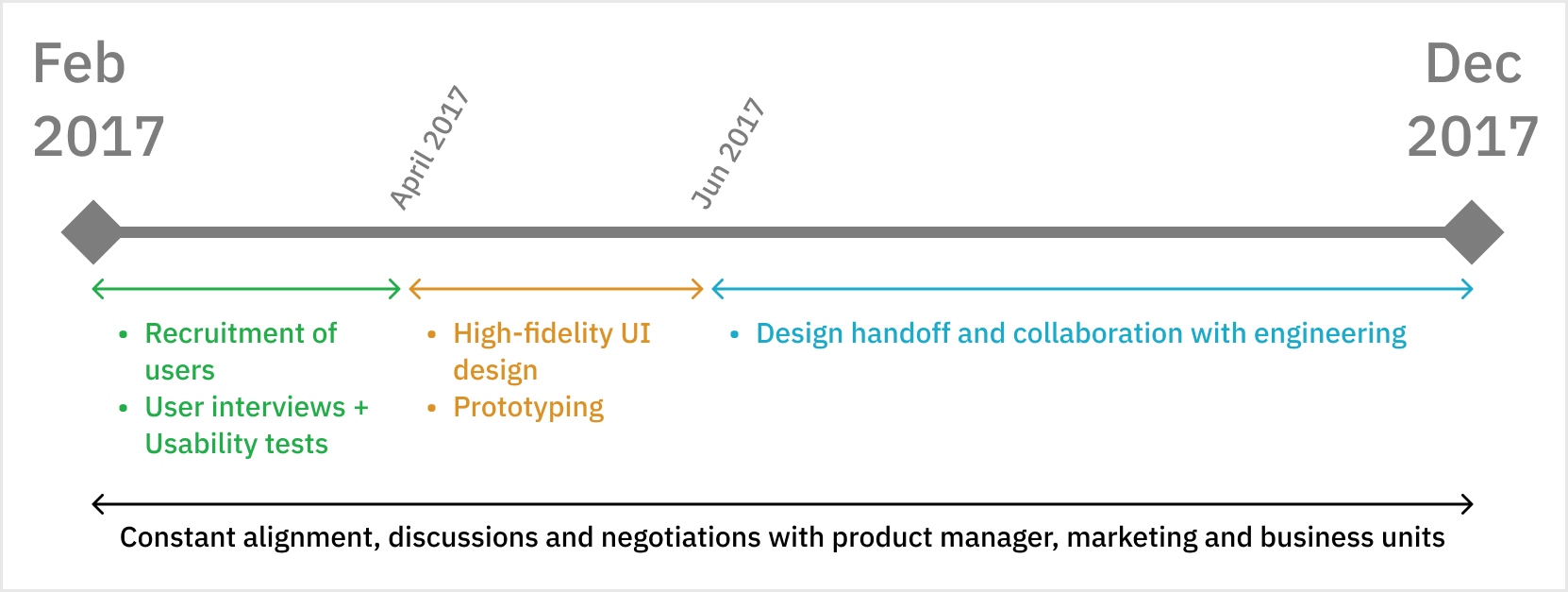
Planning and conduct of user interviews and usability tests
High-fidelity UI design and prototyping
Goal alignments with business and marketing teams
Design handoff and collaboration with front-end engineers
Assist in writing of test cases for quality engineers
Feasibility discussions with back-end engineering and tech leads to ensure best performance
Implementation of quantitative user data collection
Here is a diagram to visualized how project’s timeline from start to finish:
Planning and initial thoughts
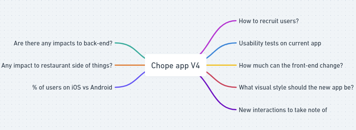
In order to get a sense of the complexity of the project, I mapped out all the big pieces of potential work or issues to take note of to keep me in check as the project progresses.
User research
For 4 weeks, I carried out a usability on the existing apps on iOS and Android, and conducted user interviews and usability tests. Breaking it down further, my responsibilities were:
Collaborated with User Acquisition Lead to survey our user base and formulate participant sampling strategy
Crafted interview guide and usability testing tasks
Conducted the interviews and usability tests
Synthesize the research data to generate digestible insights for Product team and senior management
Presented these insights to secure buy-in for design decisions from business and engineering partners
Some of the key insights include:
There are 2 distinct user profiles who choose to dine out: those who dine out for special occasions, and those who frequently dine out because of various reasons, main of which being that they do not cook, or have someone at home to cook for them.
Frequent diners can be further distilled into 2 sub-profiles - bargain hunters and taste seekers.
The top criteria for bargain hunters, in the order of importance, are Price and Location.
The top criteria for taste seekers, in the order of importance, are Cuisine Type and Location.
The current booking flow is comprehensible and 25 out of 27 users interviewed had no problems with it.
More than half of users interviewed raised concerns about various portions of the current app with regards to amount of textual and visual content that helps users with their decision making process.
All of the users interviewed feel that the app looks outdated and is in need of a revamp.
All of the users, in their daily lives, use Facebook, Instagram and Grab.
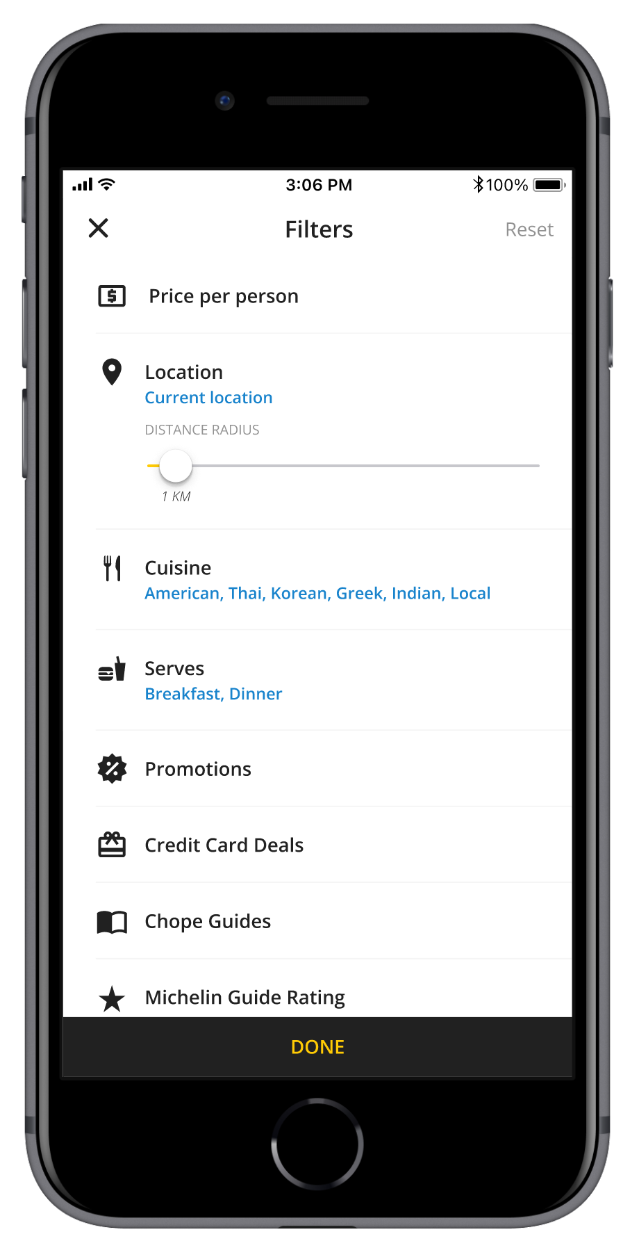
User flows and high-fidelity UI design and prototyping
Armed with user insights, I started work on crafting user flows and accompanying high-fidelity screens for iOS and Android apps. I studied the design languages and patterns of both platforms to ensure technical feasibility and ecosystem familiarity for users.
I collaborated with the product manager to come up with a roadmap that will ensure that the most essential parts of the app were designed and built first. On a high-level, we prioritized and agreed on a strategy to have portions of the app designed and built in this particular order:
Home screen
Search results
Login and signup flow
Booking flow
User profile pages
Past bookings page
Choice of color palette
In terms of the aesthetics of the app, I held several rounds of consults with various teams, showing them the current version and another that made use of blue and yellow as the main colors. Many felt that the choice of blue when put alongside yellow feels “too childish” and also clashes with brands such as IKEA. Black and yellow proved to be a strong color scheme that resonated with many. Black, when used on white, makes for good contrast and usability as well.
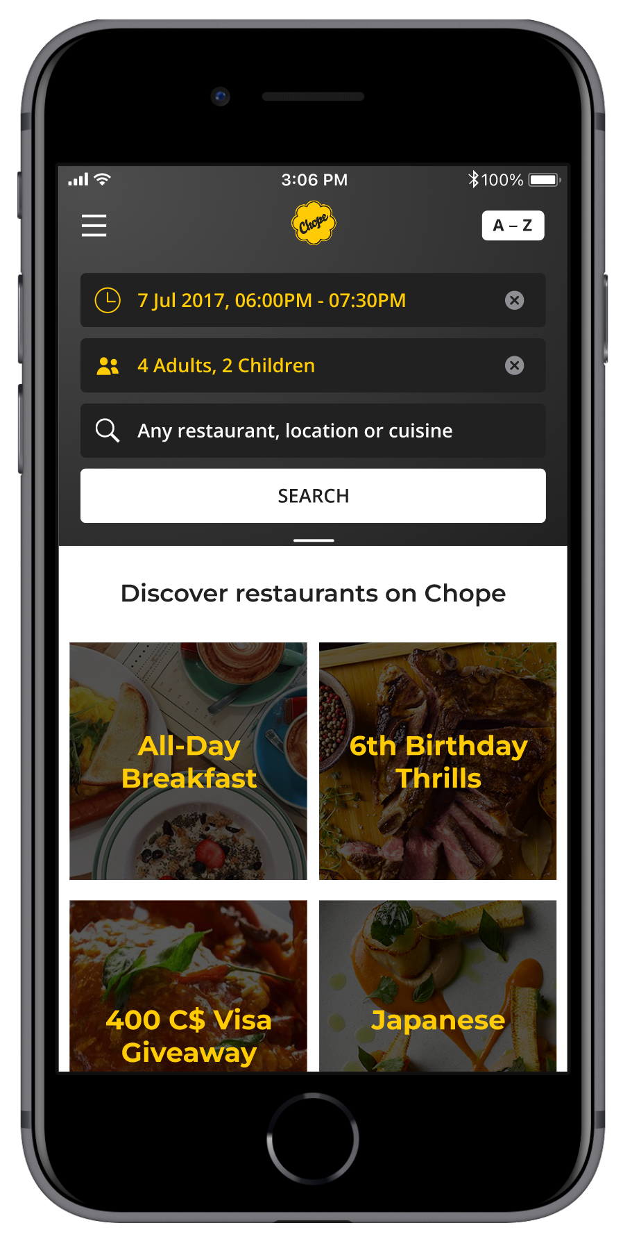
View all of the visual designs from this project in the visual designs section of my portfolio.
Working with Marketing and Business Development
Another essential part of designing a B2C app is to work with Marketing to ensure that my designs will fit with their organic and paid campaign work that had to be delivered to our restaurant clients.
Restaurant-related content are sprinkled all over the app and it was my duty to balance the amount of information that was displayed to not overload users cognitively, yet helping the marketing team reach their KPIs for restaurants around the region.
The business development was also a key stakeholder in this project, whose goals are well-aligned with Marketing. When consensus and buy-in is secured from Marketing with regards to how the new version of the app will look, business development was on-board as well. Collectively, all 3 parties are finally aligned after a month of close collaboration of how the app will look like.
Design handoff in a scrum team
With the main bulk of the screens done, now it is down to the nitty gritty. Different states of all pages are fleshed out in collaboration with front-end engineers. Scenarios are being mapped out with quality engineers. Most of the engineering partners are either based in Beijing or Chinese nationals based here, so the common working language was Mandarin most of the time.
My day-to-day tasks with my scrum team include:
Active contributor in all scrum ceremonies
Furnishing JIRA tickets with user flow diagrams for all scenarios, high-fidelity UI assets and prototypes when required
Research into developers’ documentation for iOS and Android to check for feasibility
Collaborated closely with business units to understand requirements and back-of-stage workflows
Maintained close communication with engineers located in Beijing and Singapore to ensure optimal collaboration
Development was split into 3 distinct phases and both the iOS and Android apps were progressively rolled out to Singapore, Indonesia, Thailand, Hong Kong and China users from Dec 2017 to Mar 2018.
Post-launch analytics
My product manager and I made use of Mixpanel to list and define Events and Conversion Funnels to track usage patterns - especially in key flows such as Search and the Booking Process.
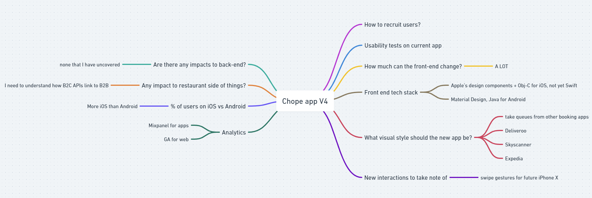
Remember the mindmap at the start of the case study?
It expanded and looked like this toward the end of the project: