Portfolio »
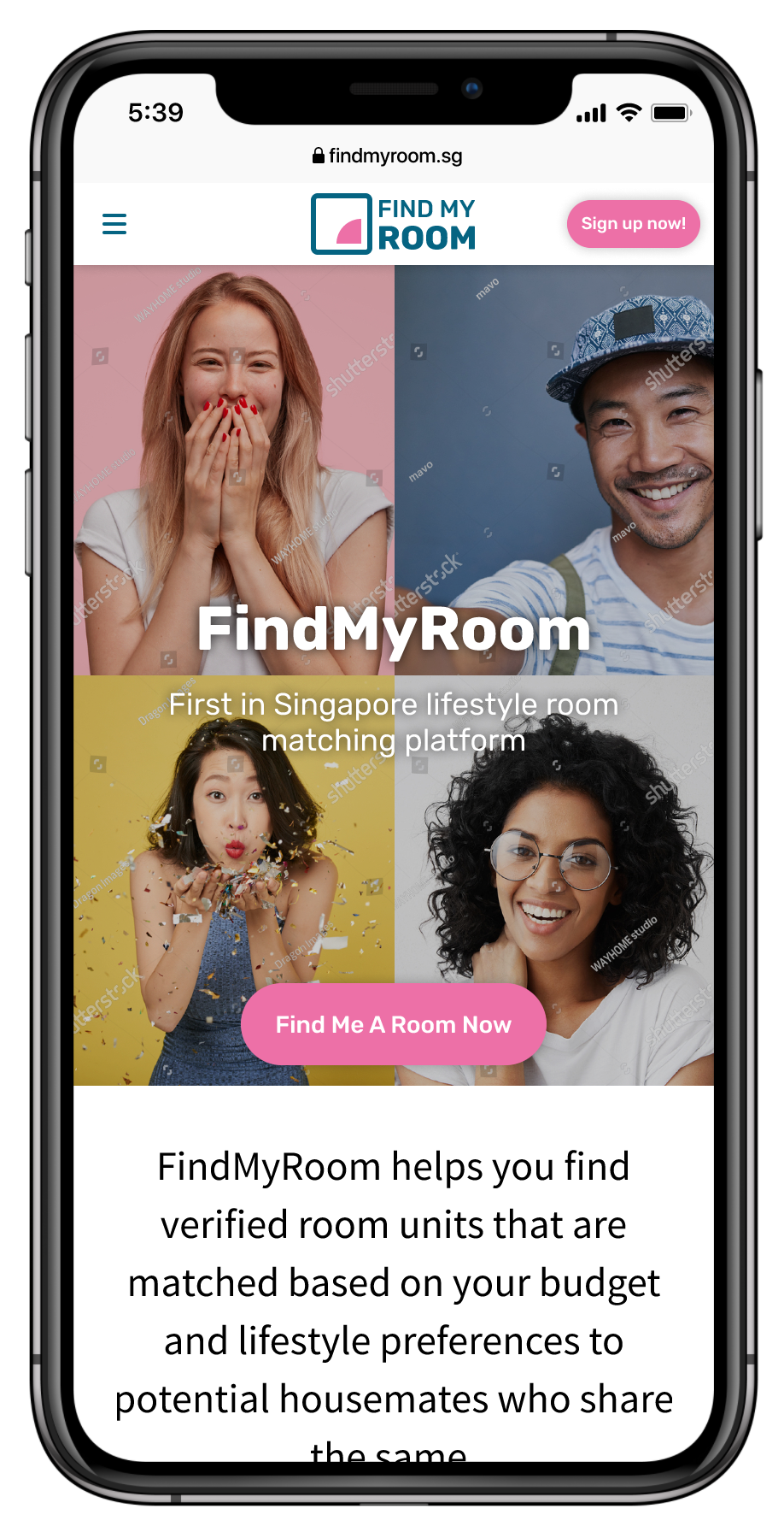
FindMyRoom
Background: a new revenue stream for EdgeProp
In mid-2018, a product manager and I were tasked with end-to-end product strategy for a co-living revenue stream.
It was an opportunity for EdgeProp to offer a win-win solution for property developers to offer unsold properties as co-living spaces to young working adults with disposable incomes to live independently off their parents.
Responsibilities
For this project I was tasked with:
planning for omni-channel customer support (includes implementation of Messenger and WhatsApp Business)
architecture of back-end processes to support the customer experience
desk and market research on customer attitudes and behaviors toward co-living
high-fidelity UI design and prototyping
accessing technical feasibility with engineering leads and engineers
logo design and style guidelines
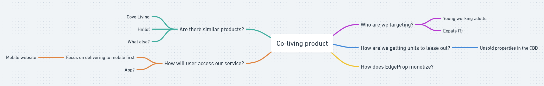
Breaking the problem down
Since I was designing a product from the ground up, it was essential to map out the complexities of the problem before diving into any work.
The mindmap below was created initially to help my product manager and I get a sense of the problem and which areas we need to focus our efforts on.
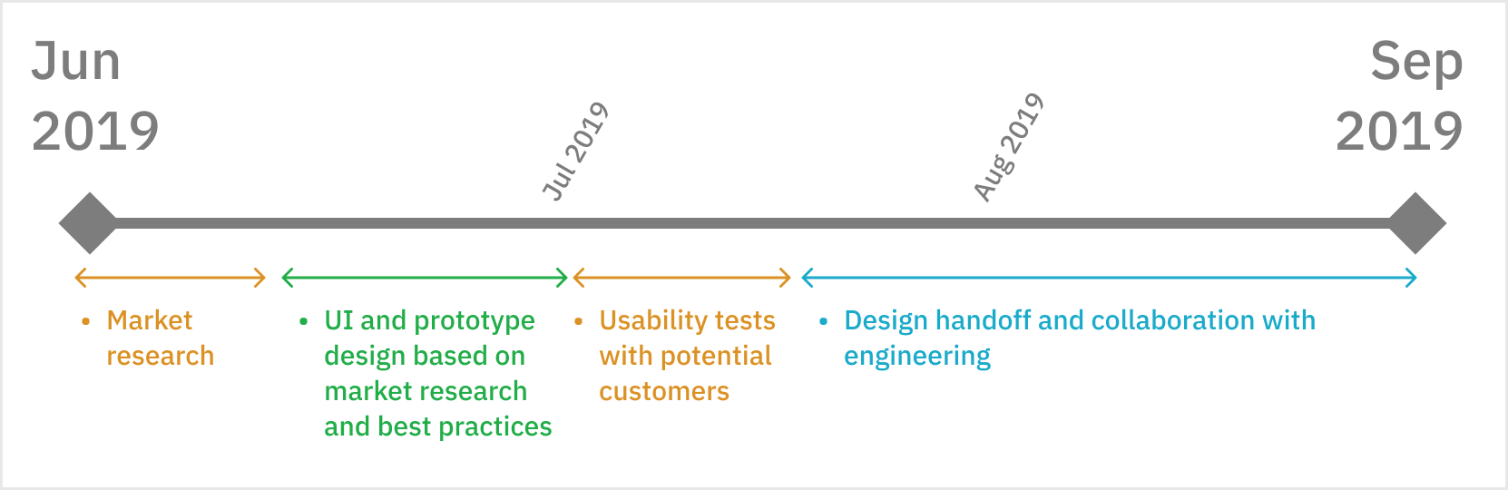
Tweaking the design process for a fast-paced project
As the timeline was tight of 3 months for the entire project, we agreed to tweak the design process such that we were working on research data that can be sourced quickly:
my product manager, being the domain expert, will be providing competitive analysis of similar products
I will be checking out the competitors to get a sense of their feature offerings
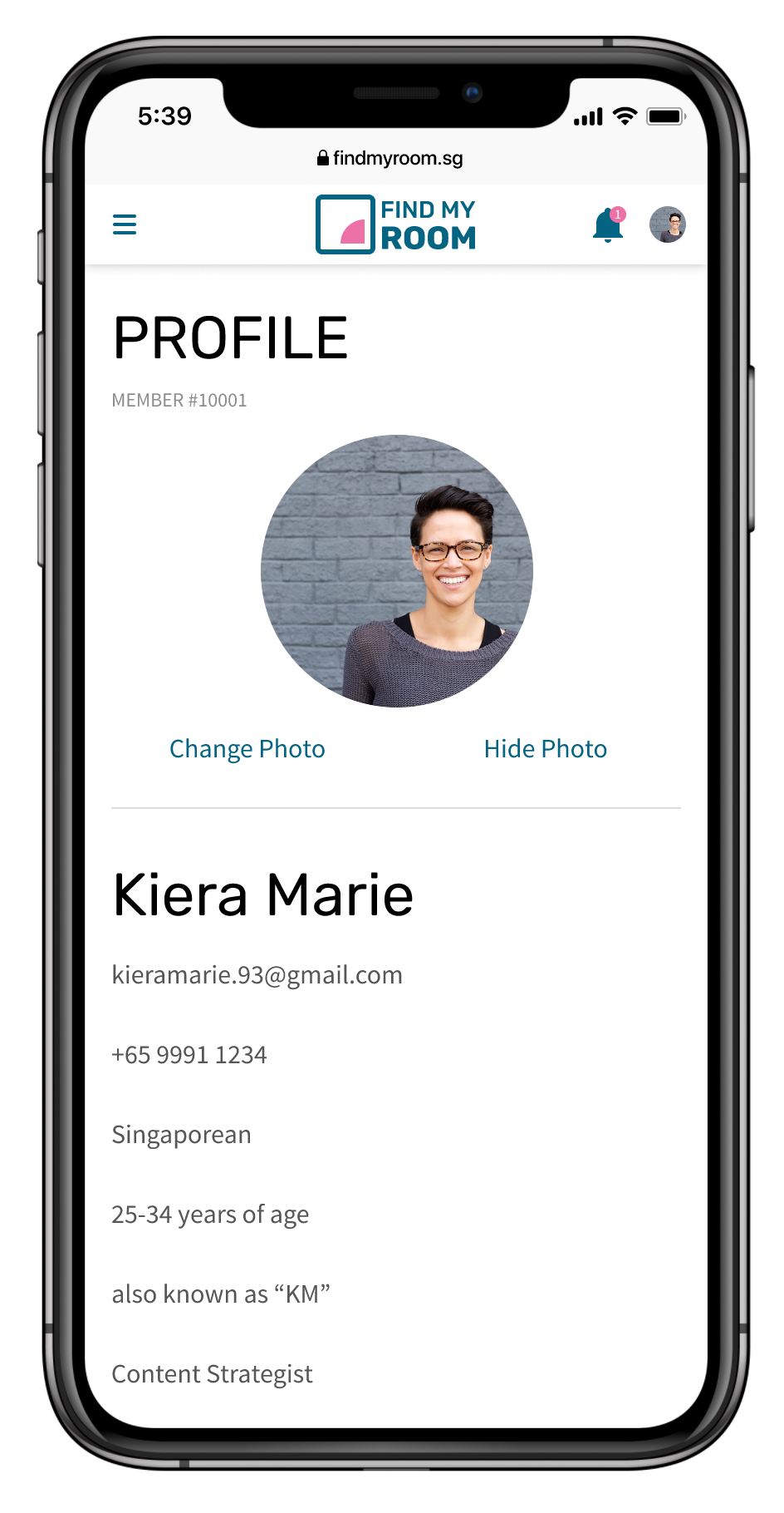
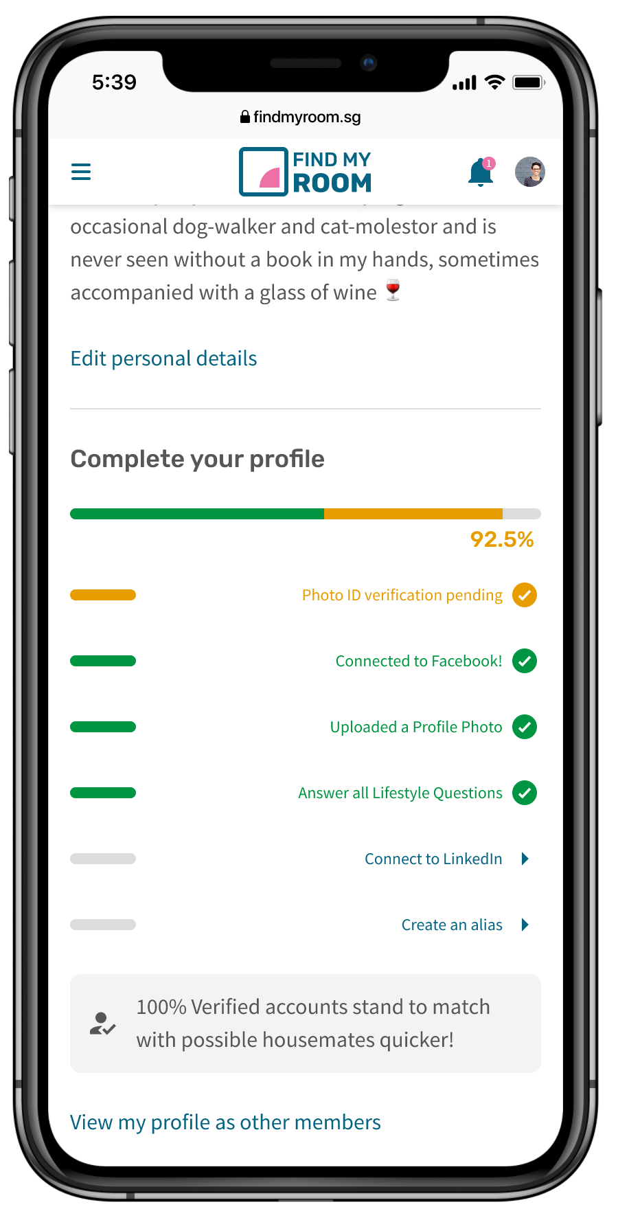
My product manager and I ideated and navigated through what our target audience are exposed to in their daily lives. One idea came from online dating apps, which we thought of incorporating into our product as a way to match a potential customer to housemates.
Brand and visual design
The brand’s main identity was about inclusivity, and in this rendition of its identity, it’s about gender inclusivity. The colour makes use of a more masculine teal coupled with a vibrant magenta to bring out the vibrancy in women.
With this in mind, I set out to make 2 strong brand colors work in terms of usability and readability.
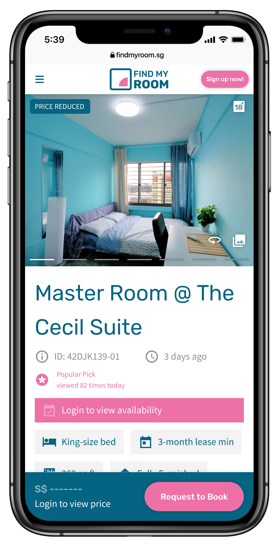
You can also see UI of how each customer’s profile will look like, a la dating profiles on dating apps.
View more samples of UI designs from this project in the visual design section.
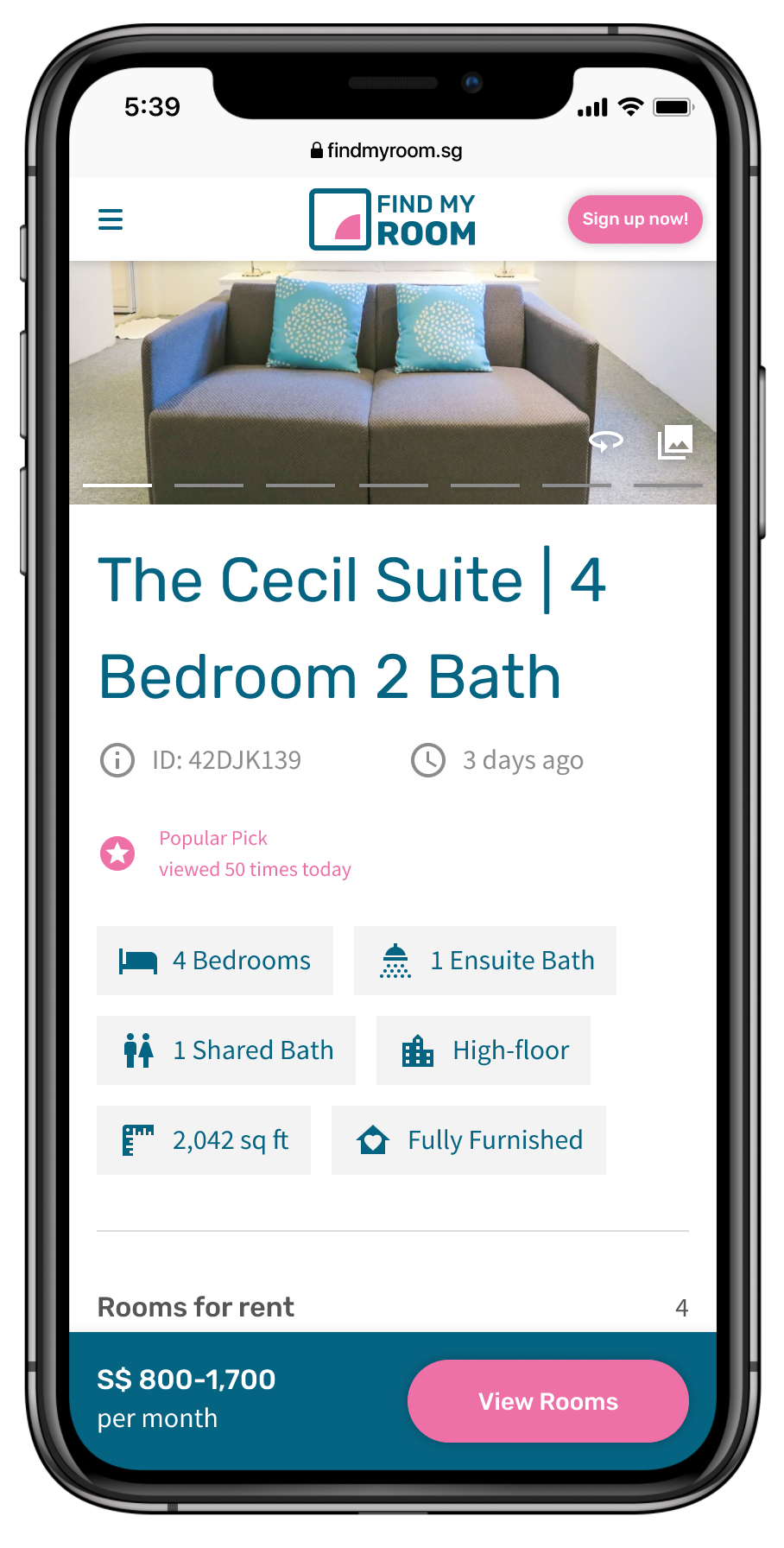
Prototypes for usability tests
Below are interactive prototypes in both mobile and desktop viewports that were used in usability tests with recruited research participants to solicit feedback.
These are augmented with usability tasks crafted to lead users through the following flows:
Completing a questionnaire to gather their co-living preferences
Signing up for a FindMyRoom account
Making a Room booking at a specified Unit
Results from usability tests and next steps
Validation for all tested flows:
Completing a questionnaire to gather their co-living preferences
Signing up for a FindMyRoom account
Making a Room booking at a specified Unit
Issues identified and to be worked on:
All 5 users’ comprehension of content were hampered by large bodies of text initially proposed by business stakeholders. Textual content should be reworked to be more concise. [content issue]
2 out of 5 users had slight difficulty differentiating between Units and Rooms, but eventually both were able to identify the correct Room, as required by the usability testing task. [can be de-prioritised]
Sentiments from participants
All of them understood the metaphor we are drawing from online dating apps when it came to matching them to potential housemates, and the traits and attributes they could provide on their profile pages. It resonated well with them and this was enough to validate the idea that we came up with.
Working with engineering
Meanwhile as tweaks to the UI are being worked on, I was leading discussions with engineering with regards to the following:
feasibility of designs based on the front-end tech stack
fleshing out all states and scenarios of all pages
writing of test cases with quality engineers