Portfolio »
SuperInspector
Background
Like its competitors, EdgeProp’s primary monetization channel is selling a suite of property inspection tools to property agents. These tools provides agents with public and proprietary data visualized in ways that allows their clients to make informed decisions before sinking their funds into big-ticket purchases or rental leases.
Responsibilities
As the sole designer on this project, I was responsible for the following:
desk research on how the property market in Singapore functions
usability audit of the current Inspector tool
high-fidelity UI design and prototyping for iOS and Android
usability tests with property agents
presentation of testing results and final prototype to senior management
collaboration with engineering to ensure feasibility
design handoff
Timeline
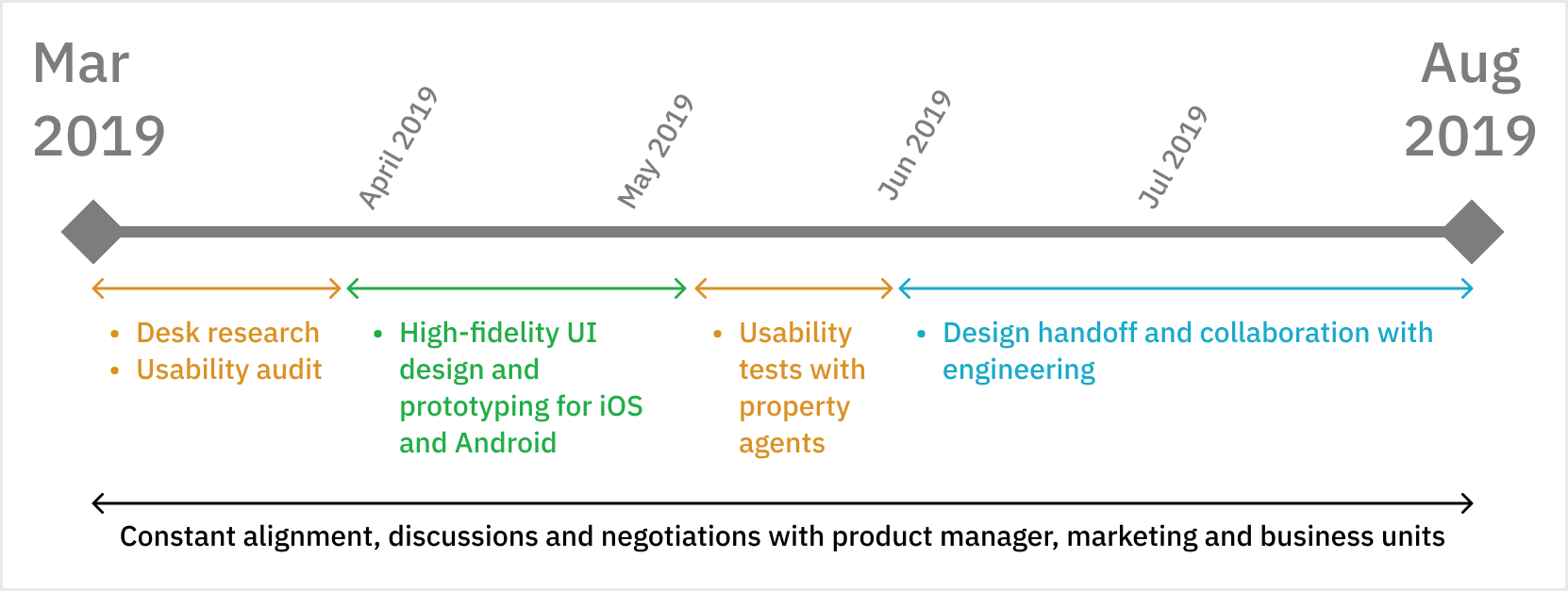
Sensing that there was a rush to launch, and senior stakeholders’ tendency to leave user research out of the process, I negotiated for usability tests with property agents after an initial draft of the prototype is out.
Sales representatives often invite property agents in large groups to socialize and sell our agents tools anyway, so it was a rare opportunity for me to reach out to users without upsetting the status quo.
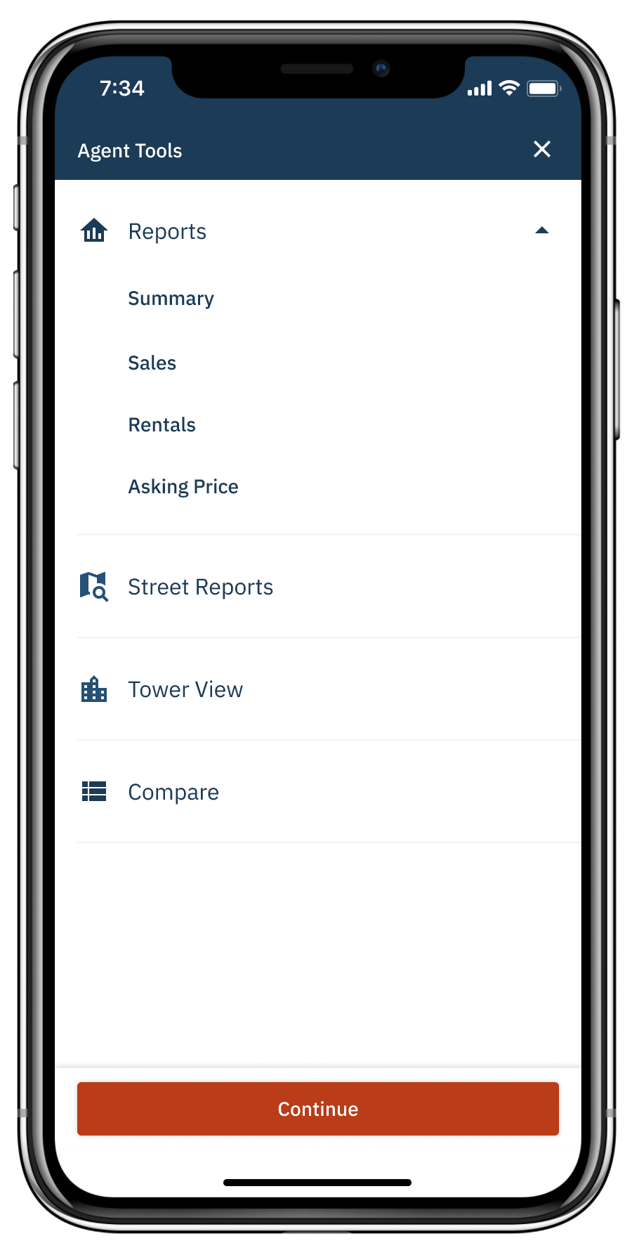
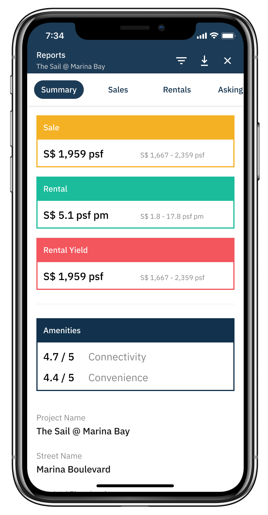
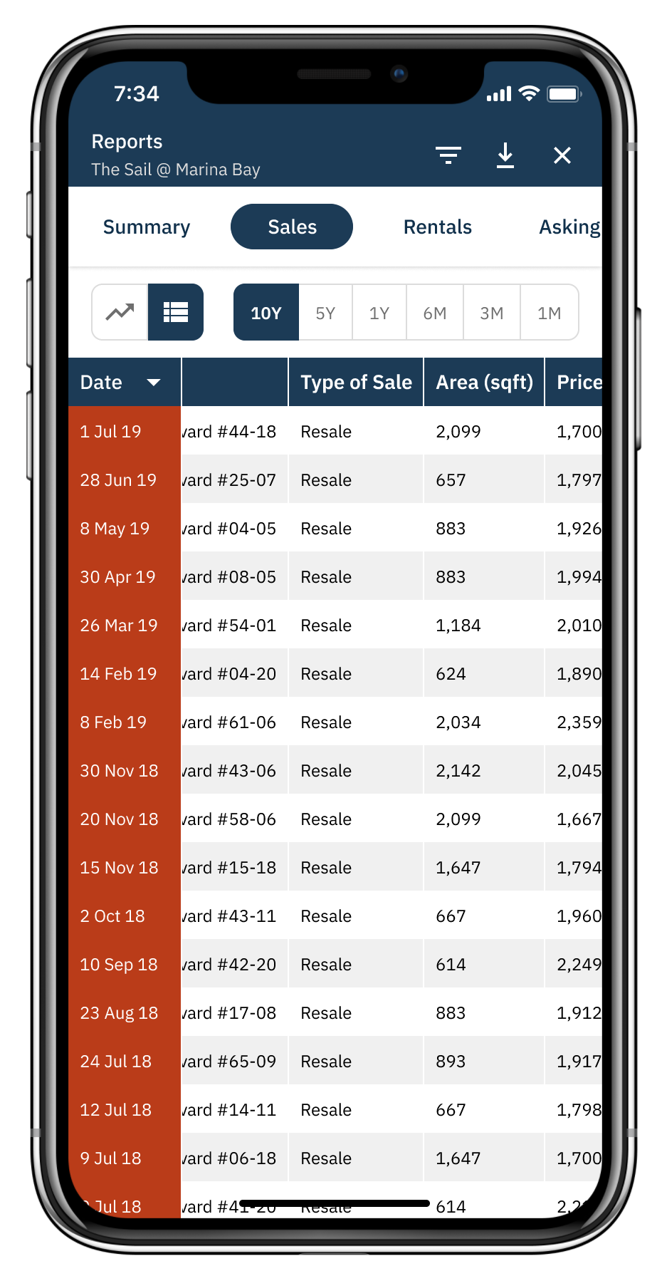
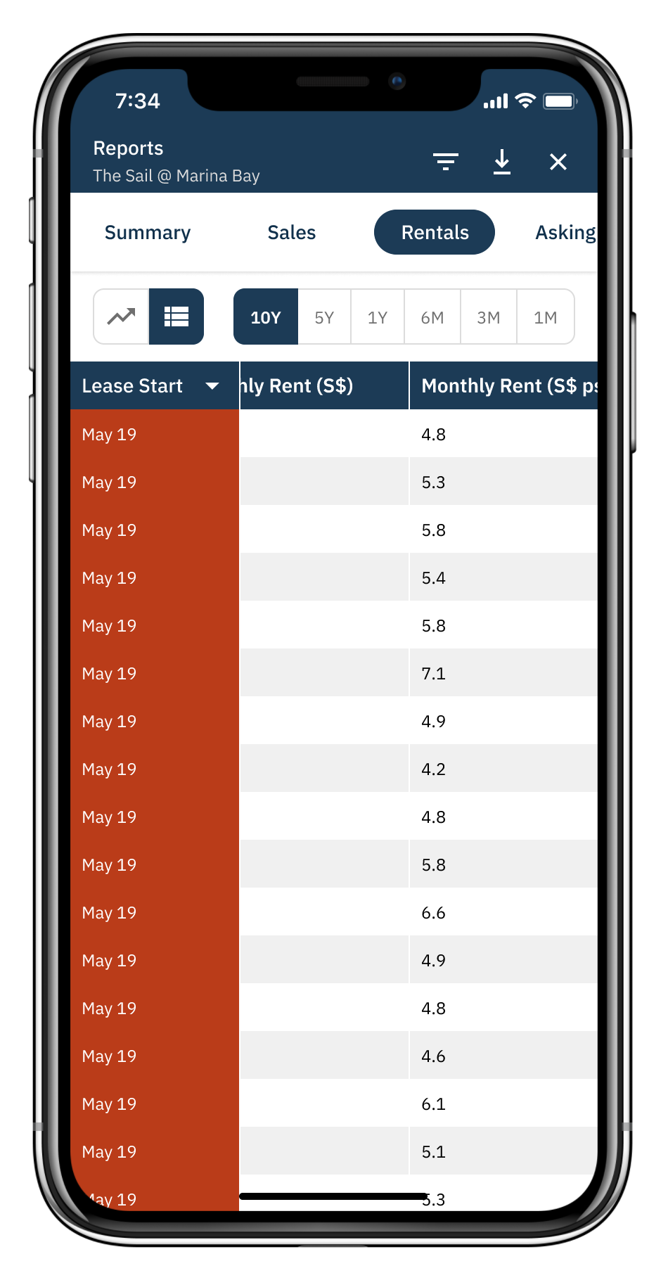
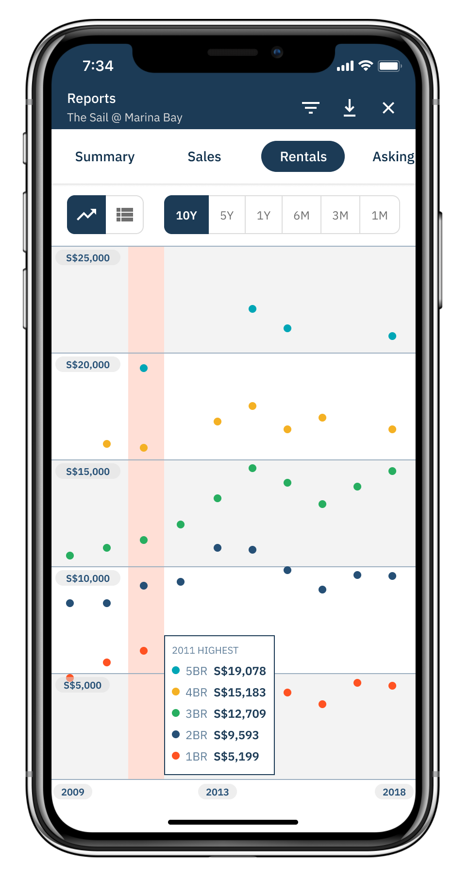
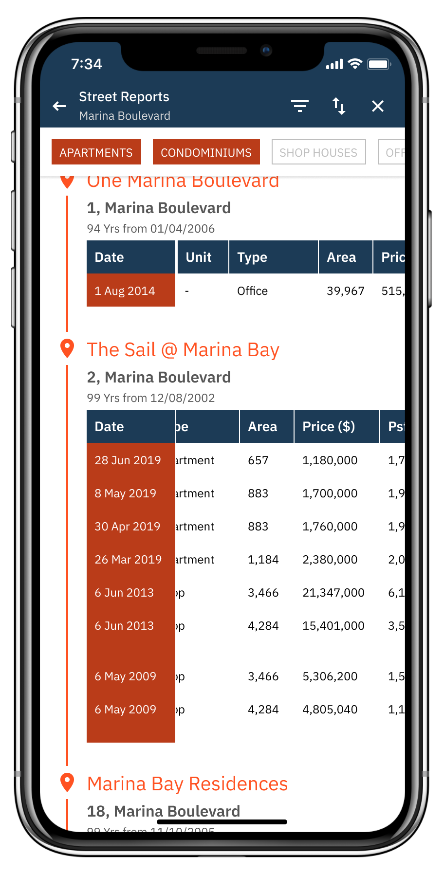
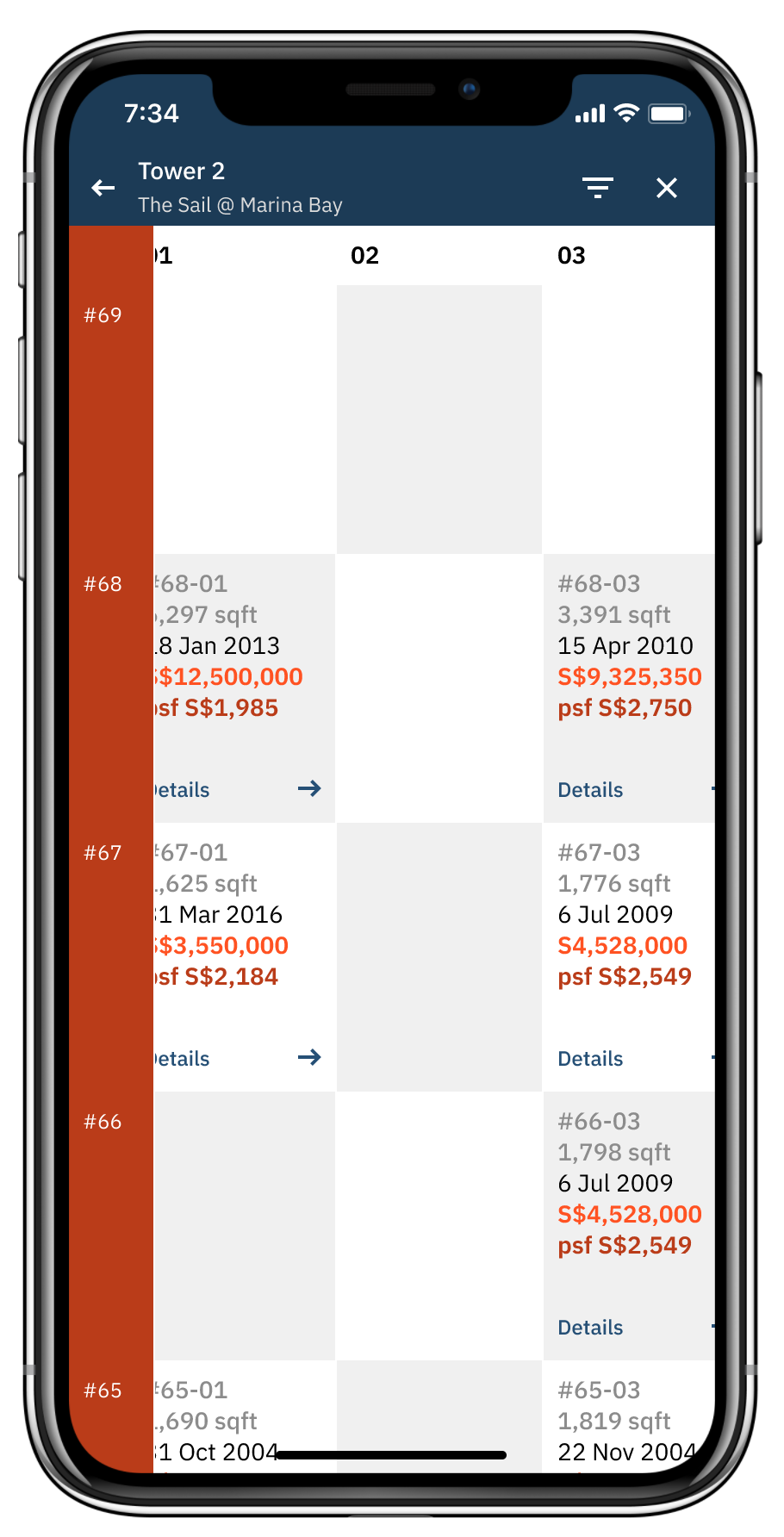
Reports, Street Reports, Tower View and Compare are 4 major “inspection tools” packaged within SuperInspector.
Desk research
Using my people skills, I got into regular conversations - formal and water-cooler-informal - with EdgeProp’s sales representatives, writers who write for The Edge, our sister-company focusing on the publication of property-related news, product managers and of course, the CEO.
Key insights from these conversations include:
Understanding of jargon is important, as with any other industries. For the property this includes: quantum, psf, buyer agent, seller agents, brokering, viewings, comms and more.
There are numerous factors to be considered in a big-ticket purchase such as properties, which is why a lot of potential buyers and sellers would pay agent fees in order to take the stress off themselves.
Most property agents buy into digital products from EdgeProp and its competitors, never only from one provider. This is to compare data from various platforms. There are also platforms with their own propriety data that no one else has.
Data scrapping is a common practice between EdgeProp and its competitors.
Usability audit
In its then iteration of the product, Inspector only had Reports, which is a generic data visualization feature that presents common information about a property to the agent. I found several problems:
The choice of font - Poppins - when used in an informationally dense product like Inspector, required more cognitive to discern between the vowel letters “a”, “e” and “o”. This is due to the very circular nature of its curved ligatures that leads these 3 letters to be difficult to distinguish between each of them. With these vowels being commonly used in the English language, this poses a readability issue.
A lack of negative space is used between UI elements in Inspector. While a product as such is inherently informationally-dense, information is not chunked properly which leads to cognitive overload and fatigue in comprehending its contents.

An informationally-dense page given the negative space to “breathe” in my re-designed SuperInspector.
High-fidelity UI design and prototyping
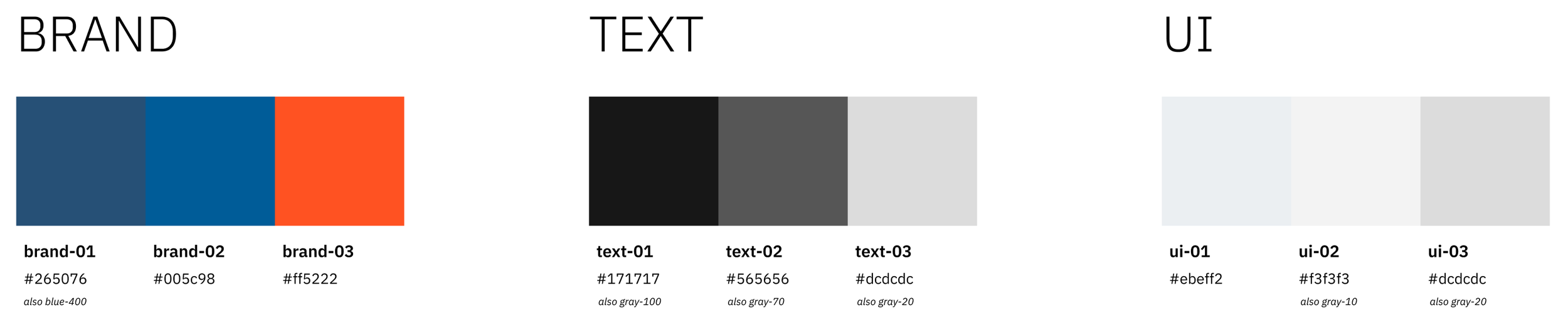
The EdgeProp brands sports a palette that includes bold shades of blue and orange, which I have documented and expanded in my design system work for EdgeProp. I made use of them as a starting part for the aesthetic of the product.
A quick discussion between the product team, the CEO and I led to the following key words they wish property agents would think of when using SuperInspector:

With these abstract themes in mind, alongside the usability issues I have uncovered earlier, this is the final outcome of SuperInspector’s high-fidelity UI design.
Feel free to interact with the prototype as well:
Usability tests
With the first draft of the prototype, I performed a 3-task usability test with property agents whom were swinging by our officers. It was structured as a simple 3-tasks test to prioritize and test out the most important flows. I consulted with the CEO and the product team about which were the most important features that we were most un-confident of rolling out in SuperInspector. This way, we were able to validate and ease those concerns while taking the least amount of time out of the property agents’ schedules.
Collectively, we agreed that we wanted to test:
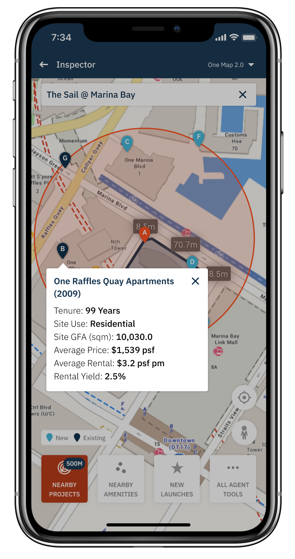
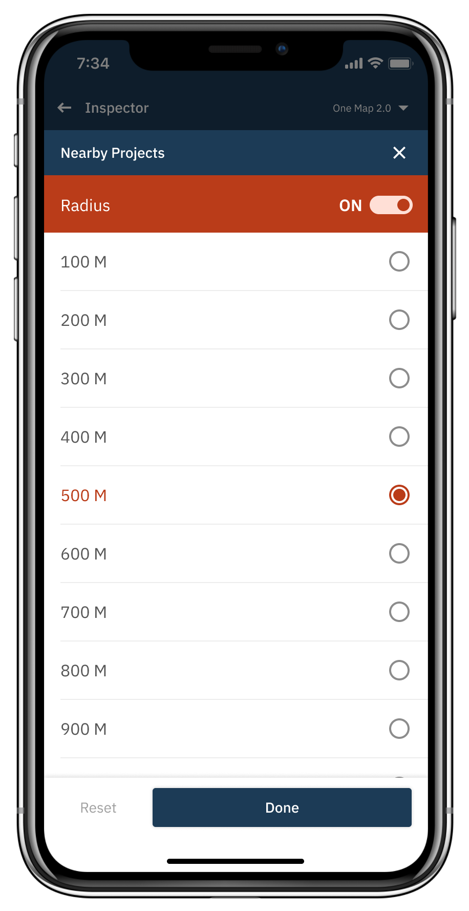
Location scan
Tower View
Nearby amenities
And these were the tasks respectively:
I want to keep my options open and see what other properties are nearby, but I also don’t want to be too far away from my office as well, so can I see what is within half a kilometre of The Sail?
I am interested in a high-floor unit at The Sail, can you show me more information about them?
So where can I buy groceries from if I sign a lease at The Sail?
Testing results
All of the 6 property agents we tested with were able to complete all 3 tasks! As a team, we were thoroughly confident of the prototype I have initially come up with. With that, engineering began to become more involved in this project.
Working with engineering
As the engineering resources were limited, it was difficult to fully realize my prototype into reality.
Many UI components were difficult to create by customising out-of-the-box components from Apple’s and Google’s development frameworks. Complex UI components such as horizontally-scrollable tables with a persistent left-hand column had to be custom-made. My good relationships with engineering meant that they kept trying for me, but were honest and open about long timelines.
I was in the midst of these discussions when I departed the company.